

New Media, One Year In
To win you must go direct, and to go direct you must be interesting


America | Tech | Opinion | Culture | Charts
We’re excited to announce a16z’s Talent Engineer Fellowship: an 8-week cohort for the people building at the forefront of recruiting. - Danco

A16Z New Media is one year old! And we’ve had several portfolio companies (and other venture firms) ask us how our team works, how we built it, and how they might build their own. Here is what we share with them:
If you’re ever pitching a16z, at some point we turn it around and do “the Bear Hug”, as our competitors call it: we pitch you on all of the resources and power and networks the firm will put behind you; maybe you’ll have dinner with Marc until 2 am, and close out the restaurant while he regales you with detailed knowledge of your domain. And then we’ll follow up the next morning with 20 tangible things we’ll help you with in our first week of working together.
“New Media” has become one of those critical things we advertise in the Reverse Pitch, as a way a16z helps you build your brand, reach key people, and win the battle for attention.
“a16z New Media have been more helpful in a few weeks than most investors are across an entire cycle.” — Fredrik Hjelm, Pit
What do we actually do? It won’t capture everything, but at first estimate you can think of a16z New Media is “go-direct as a service” for startups. We have four primary motions:
In-house creative (Video, design, editorial, from legends of the craft)
Owned channels (Our X account, Substack, podcast feeds, and more)
Full service from a dedicated team, from pitch to launch and beyond
A big network of people, with a bit of structure, software and AI to help leverage it
Let’s go through them:
1. We have in-house creative, notably for video and for writing.
Ben & Marc are both genuine aficionados of media history, and they can talk to you for hours about how media has evolved over their careers, from a highly polished, careful exercise (basically, “there’s one job, and it’s don’t say anything that gets you in trouble”) into a more authentic, unfiltered practice where being interesting is what matters. When we talk about “New Media”, we mean this new world where to win you must go direct, and to go direct you must be interesting.
Launch Videos are a new (and we think, enduring) format for founders to make a statement at a critical moment, that’s built for this new media environment where you don’t have to ask permission to get on someone else’s show or op-ed page: you can just make your own statement, however you like, and share it widely.
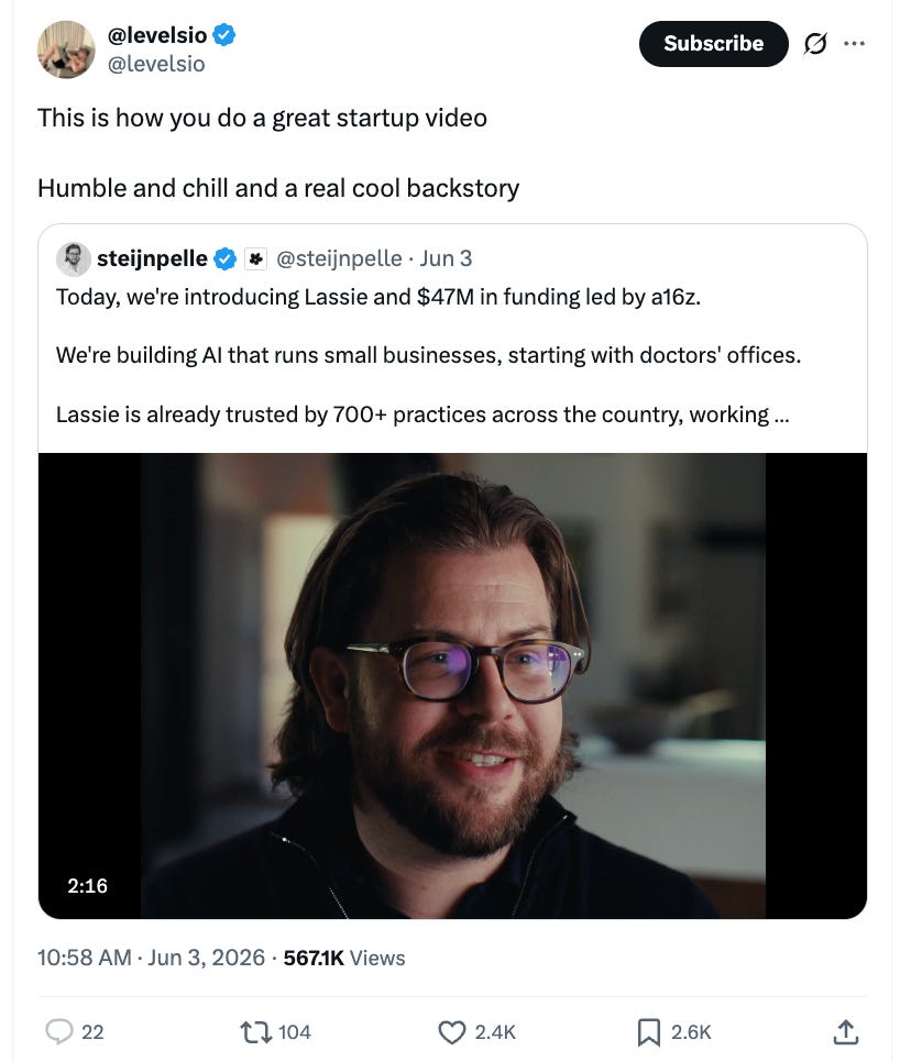
“Tell your whole story, in a couple of minutes” is a great constraint, and we love the challenge. We have a video team in-house at a16z that produces them, on timelines that most contract agencies will tell you is impossible. We know how important speed is for founders! Not only because everything at a startup moves at a fast pace, but also because creative work is about catching lightning in a bottle, and really nailing the energy of a moment. When video production timelines stretch into months (which is usually the kind of lead time an agency asks for), you’re probably going to lose some of the magic.
Founders love it! They love the ambition, and the pace, and the final product. Here’s AI legend Dr. Fei-Fei Li, on our work with World Labs:
“Four weeks before our Marble launch, their New Media team proposed an idea I had never seen before. They wanted to shoot our announcement video on a 3D LED volume stage, with our own product generating the environments in real time. They partnered with us on everything: the cinematic video, a behind-the-scenes documentary, a launch event, introductions to influencers in the VFX world. The launch went viral. We hadn’t built up our marketing muscle yet, and they helped us lay the groundwork for our operation. That kind of support, from creative vision to company building, is not something you find elsewhere...”
Meanwhile, we also have an editorial team that helps founders (and our investing partners) think through written ideas, capture them as essays, and serve as editors and thought partners. Many founders we work with are outstanding writers already, others want to work at the craft and improve. Either way, founders really appreciate having someone outside of their company they can talk to, and who can help them frame their company in a way they may not have considered before. This can be helpful for all stages of companies, even really big ones.
We love working on all kinds of essays. One founder might have a really big and clear idea that they want to share about how AI is changing work; another might be focused on nailing the written “why” for why their company exists. The right written piece, stamped with the endorsement of a firm like a16z, can make a real difference in the trajectory of a company, and in the “legible interesting-ness” of a founder and their product.
It’s important that founders are interesting! Because venture capital, and startups in general, are an exercise in preferential attachment. People have to eagerly want to attach themselves to you, your idea, your product, your team, your vision. Of all of the limitless opportunities out there, people have to preferentially attach to you. That’s a tall order right now, when limitless opportunity is all over the place. That’s why our in-house creative teams exist in the first place: to help you win the battle for preferential attachment and attention, by bringing out what’s already interesting about you.
Now, this in-house creative work is similar, at surface-level, to the kind of work an agency does, although there are world class agencies out there that we recommend and partner with. But there are some important differences though, and one is the kind of people we have on these teams. We honestly believe that we can hire much better people than your average agency. The job is more interesting, and the work is more incentive-aligned.
Founders really appreciate that they’re talking to people like Gaby Goldberg, Alex Danco, James Reina, or others they feel are “on their level”, in their ability to follow the plot, understand the subject matter, and deliver on their nuanced goals. We love hearing from founders, “I’ve read your Substack for years! I’d love to write something with you.”
2. We have owned channels, with our brand and reputation on them.
New Media is about being interesting and saying what you really mean, versus Old Media where you were mostly trying to stay on message and keep out of trouble. That’s because, in the old world, you were entirely dependent on other people’s channels to get your word out. There were a select set of newspapers or TV shows that could legitimize you, and if you ever made them mad, you were in serious trouble.
Even worse, the old line used to be, “Either you’re journalism, or you’re PR Flack.” As a founder playing the media game, you were either one or the other. There was no category in the middle, if your goal was, “I want to tell my story and be authentically understood.”
Now, “New Media” as an open playing field where anyone can tell their story is a great thing; but distribution is obviously still important in this new world:
We have our X account, with a million followers
We have a daily email newsletter with a quarter million subscribers
We have the podcast, with a million downloads a month
We have emerging (for us) channels like Instagram, where we have 160K followers and growing fast
There are two reasons why this is important. The first one is straightforward: when you work on an essay or a launch video or something else with us, we can guarantee you distribution. When you work with other agencies and investors, they can’t really promise you reach, in any real sense. (But some do anyway, and we’ve all seen launches with engagement metrics that don’t pass the smell test, if you know what we’re getting at. That isn’t a game we play at a16z. We don’t need to, and we’d never jeopardize your reputation that way.)
“The launch went as well as it possibly could have gone. Tons of people messaged me that we ‘took over the timeline’. And without doubt the amplification by a16z New Media team helped significantly.” — Will O’Brien, Ulysses
The second reason is more interesting, and has to do with what distribution even is, in a world where the important brands are people now, as opposed to companies.
There’s an important New Media principle that signal is what’s important, and people confer signal, not brands. Founder, partners, researchers, power users, and great X accounts are all characters who make an idea legible and credible. Our friend Anu wrote a piece on New Media the other day, “New Media is Insider Media”. We’ll quote a bit of it here:
“Insider Media is media for insiders, by insiders. Both creator and audience belong to the same in-group. The public gets to be in the room but is never the audience being catered to. The topic is less important than the audience whose opinion matters. It’s a closed-room broadcast where principals talk to principals while fans, aspirants, and adjacents watch, learn, and report out.
Insider Media is the opposite of journalistic media—outsider media—made for outsiders by outsiders. Outsiders will call Insider Media an echo chamber or bubble, but the proximity is very much the product. This tension is inevitable in any world where status compounds and access is currency.”
Anu is right on with her definition here, but there’s an important way in which we think about it a little differently, which is that “being in-group” is more positive-sum than people think. The whole point of tech is that it’s a growing pie, there are more interesting people and ideas and storylines each year than in the previous year.
Our goal with our channels, and all of the reach they can confer to you, is to help lots and lots of founders become high-signal, because we don’t think it’s a fixed pie. This is completely consistent with everything a16z has ever stood for: we’re about helpful-maxxing, not gatekeeping and withholding our distribution only for the very select. That’s why it’s so important that we own our own channels: we don’t have to “measure out” founders’ signal or access, we can simply share more, all the time, because no one can tell us no.
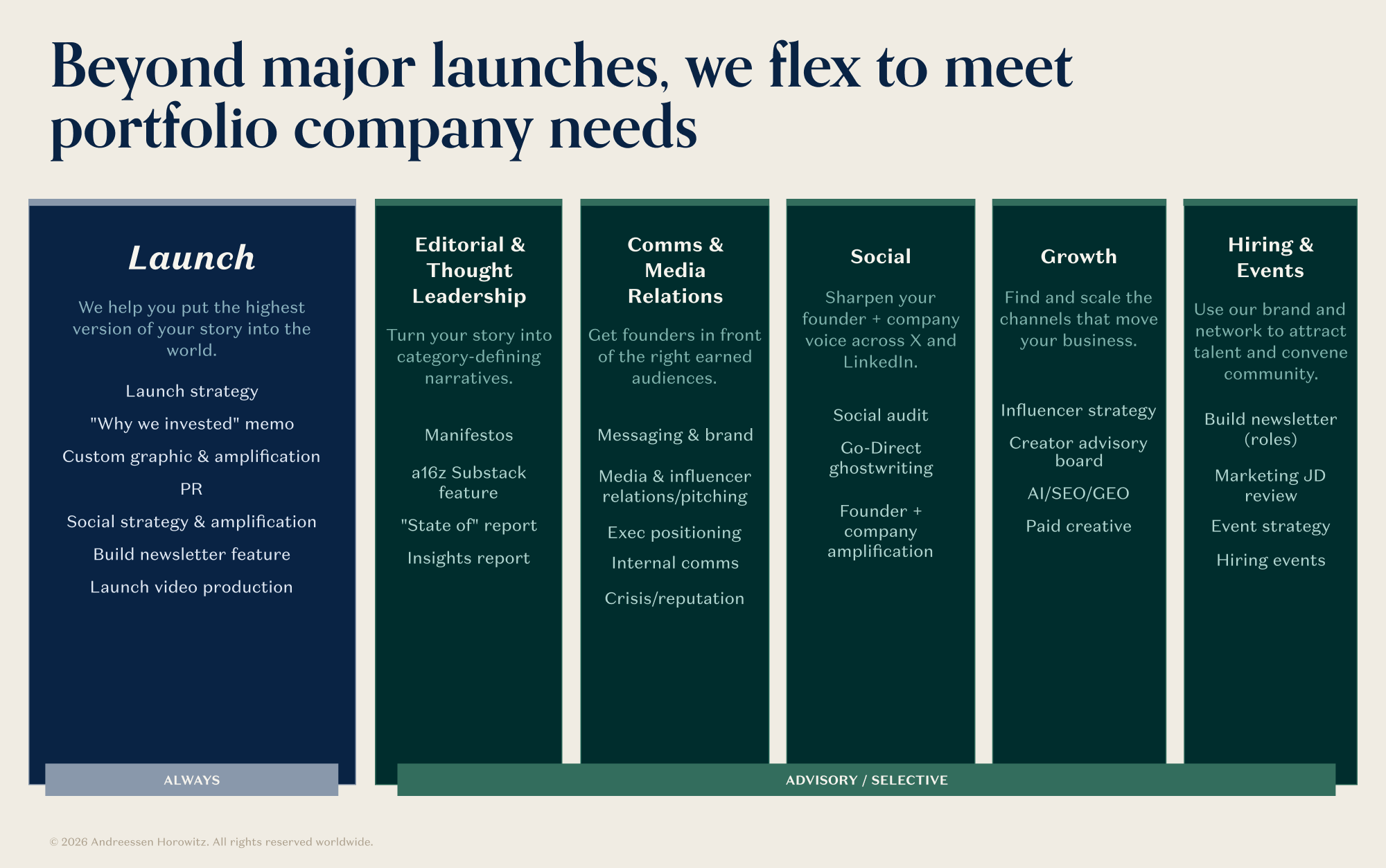
3. We have a team of high-touch service people who figure out how to best help founders, and then get it done, concierge-style.
We told you about the ‘reverse pitch’, where in fundraising meetings, we turn the chairs around and we pitch the founder. Founders really love this, because it actually firms up what working with a16z looks like. It’s a good introduction to how a16z is different from other firms: we don’t just have one marketer who writes you a one page plan that you subsequently ignore. We pitch you on a whole bunch of things that we are then on the hook to actually deliver!
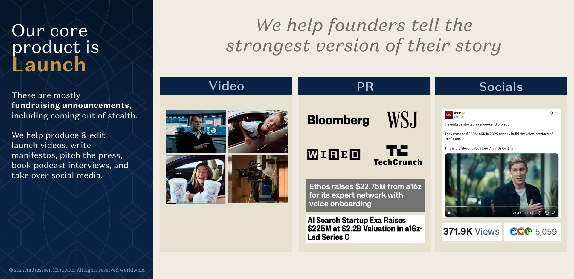
After the close, our “portco services” team is how we keep that commitment. The team figures out what the founder is actually trying to accomplish and then stitches together the right capabilities across the firm. For a launch, that might mean securing a key video asset, getting a great piece of writing written on time, lining up press, and making sure all of it lands on schedule. Oftentimes, this includes traditional comms! The right story in the right publication can still matter a lot. But the press hit works best when it is part of the larger system, and undergirded by the founder’s own framing. Our comms & marketing partners at a16z are seasoned veterans at this, and they know how to get traditional media working for you without compromising any of the “go-direct”ness.
These launches aren’t just about looking good on the timeline; they drive measurable business impact. We’ve seen startups gain tens of millions of dollars in contract value, growing massive waitlists for their products, doubling their hiring pipeline, and other really tangible things.
“This entire launch from the video to the socials to the press briefings … I couldn’t imagine pulling it off with any other investor in the world, you all are 1 of 1. Thank you.” — James Lo, Ethos CEO
“This was the strongest launch we’ve ever had, even compared to the very first launch of the company.” — Mohammad Norouzi, CEO, Ideogram
For many of our technical founders, New Media is a new muscle. Most founders don’t fully believe the power of it until they see its impact for themselves on their business. Increasingly, we’re thinking about our portfolio services team’s role as helping founders see an “existence proof” of how New Media can help them book meetings with hundreds of top customers, or drive hundreds of inbound job applications, or catalyze their next funding round.
Once founders see this impact, they often can’t get enough. So we’ve seen enormous demand to hire “data storytellers”, “heads of socials”, and “technical long-form writers” after working with our team. We’re now scaling up our efforts to help portfolio company CEOs build their own internal New Media capabilities.
It’s tempting to read all of this and assume it only works for the kinds of founders who are already resonant: the Brian Armstrongs and Palmer Luckeys of the world who were already going to win the attention war. But we have an equally good time working with founders who have built something important but need help fighting the battle for attention; not because their work isn’t compelling but because being compelling on a timeline is its own hard-to-cultivate skill. It helps that we can employ all of the format advantages that New Media offers as a category: the “one hour podcast, one minute clip” format has proven effective at bringing out what’s interesting about people with something to say; even if they aren’t polished or on-message.
In this sense, “New Media” as we practice it isn’t really a type of content; it’s a type of packaging that’s designed to help you be interesting. For example, it might mean:
The “longform conversation / essay + short form clips” barbell, or other formats designed to highlight compelling ideas with messy context rather than crisp on-message
Guerilla-style amplification, like mastering the QT format to get an essay the algorithmic traction it needs to break through: doing whatever it takes to deliver the longform idea to the select audience that should hear it
A well-crafted press campaign that can get you a media spot because you don’t need it, but they want you anyway
This is why having a portfolio services team that coordinates everything matters a lot. The point isn’t to “ship a bunch of content”, the point is to highlight what’s already interesting about the founder and their product, make it resonate on the timeline, and gain signal within the group of people they care about. After all, our goal isn’t for founders to have one great launch day and that’s it - it’s for them to build great brands that compound over time. Founders and their marketing teams can learn on their own how to make great content (just by being interesting!); where we teach them a useful skill is how to consistently package it, so that their brand will compound and strengthen for the long haul.
4. We have a giant network of people, who know and trust each other, and a little sprinkle of software and AI, that helps us put this network to work for our founders
The battle for people’s attention and the quest to be interesting isn’t only fought on the timeline; it’s also fought in person, in small groups and in perfect introductions. Preferential attachment for the important things is ultimately something that happens between people who trust each other. Which brings us to our fourth team:
We have a pretty great dataset of “who is everybody in tech.” We’re a big venture firm, we take a lot of meetings, we’ve meticulously held onto everything we’ve learned over years of being in the business. And now, finally, we can really do something with that potential.
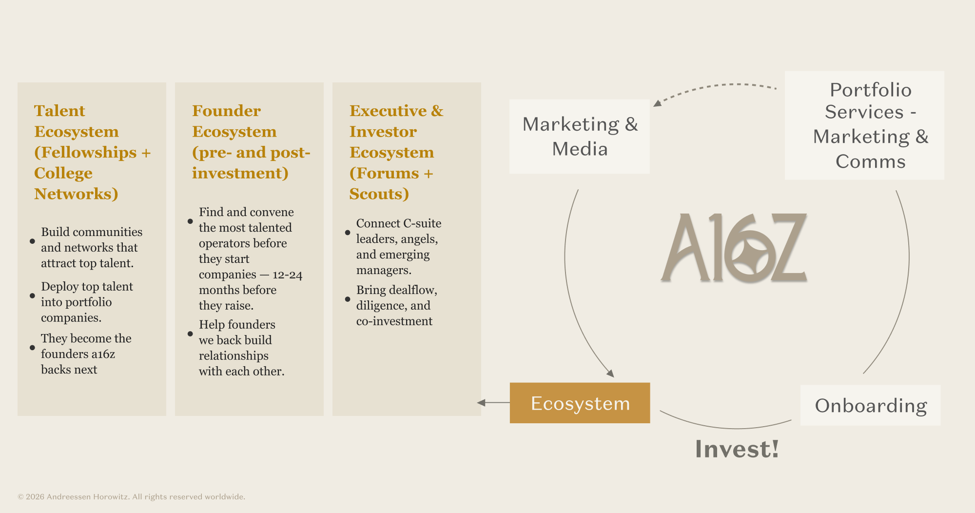
The most obvious way that we can help founders is to help them hire. And hiring isn’t just about blasting out job posts; you need a network of people who trust each other, can surface the right signals, and care about who they put forth. (But the blocking and tackling of job posting still matters. Our Build Newsletter, which features lovingly curated job postings from the portfolio, is a founder favorite.)
You also may have seen our New Media Fellowship, which launched last year as the first of many talent & hiring fellowships run by this team.
Fellowships help you meet really high-quality people who share your craft. We bring together the best operators in fields like new media, design / growth / forward-deployed engineers, and more, and host dinners, run groupchats, and sometimes invite 90+ people to Carmel for a couple of days to learn from each other and share wisdom. One thing you might notice about the fellowships themselves is that they all containerize roles that never really existed before until a few years ago. As our tools change, our jobs change too.
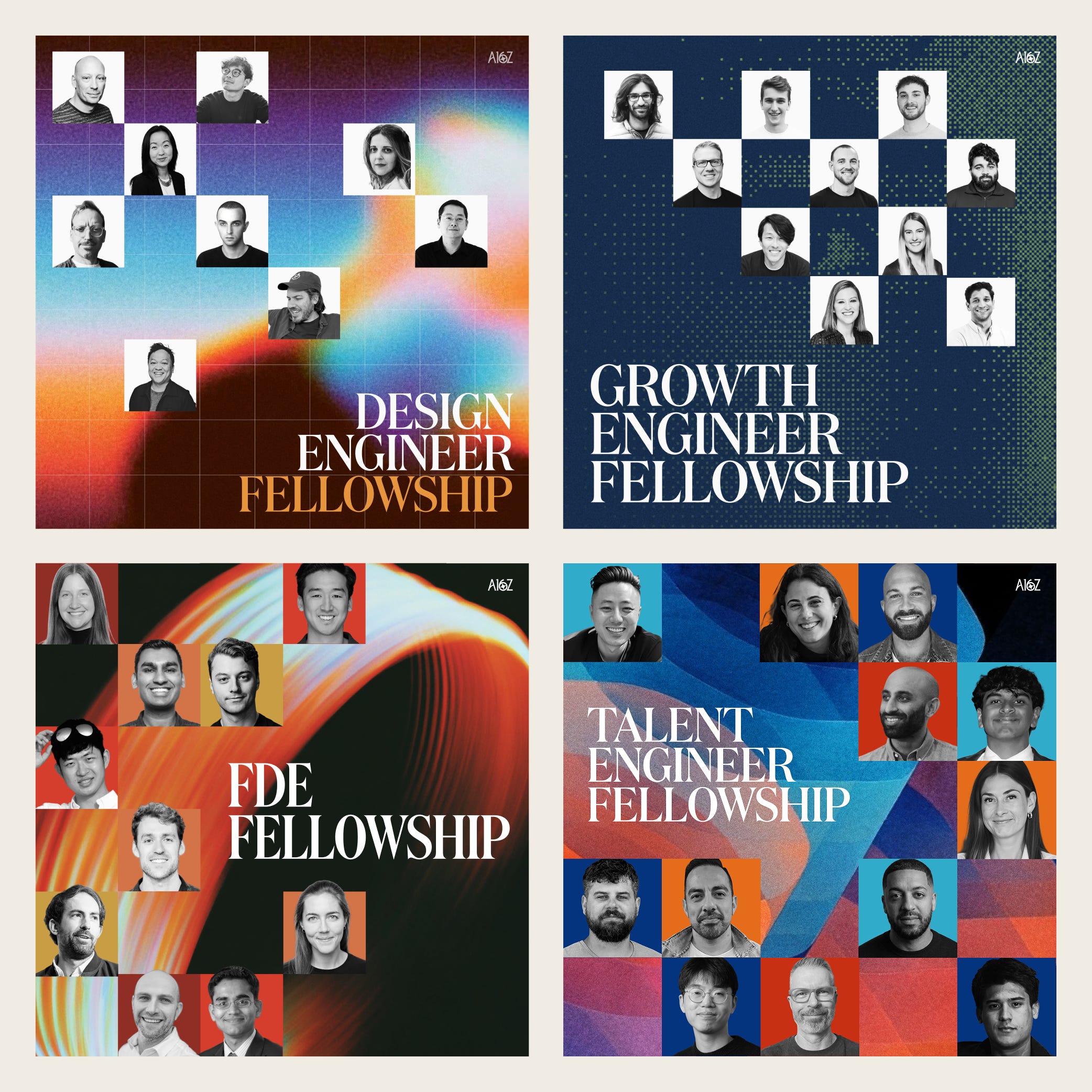
We have three goals with these fellowships: One, to help founders hire great talent, and level up their own leadership bench. (That one’s obviously useful, and everybody asks for it!) Two, to build relationships early with people who might start their own companies, so that when it comes time for them to pitch us, we have a rich set of experiences with them.
The third one is our favorite, and actually the most meaningful thing for the community long-term: it’s to help people practicing these new crafts meet one another, and learn how their peers are practicing the craft and move through their careers. We feel like this is a really valuable service we can provide, if we’re helping thousands of people make meaningful connections, and maybe find that perfect job with a portfolio company.
To pull this off (and much more), we host and facilitate a lot of events. Our events team is genuinely great, and they pull off everything from small curated get-togethers to big statement bashes flawlessly. There’s a magic to doing them well, and doing them often.
There’s a lot more coming soon on this front, including similar communities for executives, emerging investors, and something very cool on the “help make hiring better for everybody” front that we’ll announce soon.
So, what is New Media?

The funny thing about New Media is, it isn’t actually new! The world has always had interesting people who are expansive but not polished; fascinating but frequently off-message, whatever. There have always been niche media formats where these people can shine. What’s different now is that the world changed, in many ways that reward being interesting over everything else. So now there are ambitious people, and very profitable business models, pursuing New Media as a deliberate offensive business strategy.
Over the past couple of years, many of the startup marketing and comms job postings have suddenly become “New Media branded”, not in the sense that any of the tasks are new (the jobs themselves are pretty familiar to anyone who’s ever worked at an agency, run a social media account, or been a staff writer somewhere.)
Are these new jobs? Well, yes and no. They’re not new jobs in the sense that, if you look at what all of these New Media folks are doing, it’s pretty classic marketing and comms work:
What’s different, again, is the packaging and the branding of the overall effort. It’s meant to attract interesting people who are subject matter experts in something, internet-native, and eager for a lot of responsibility. Many people on the New Media team were doing something else before—they were founders, investors, product managers, or just happened to love posting, blogging, or making videos; but didn’t know there was a role that was ambitious enough for them to deploy these talents.
The roles can feel hard to describe until you’ve seen them in action. We actually see this happen all the time: once we work with a portfolio company on a project, especially when we embed someone there, they immediately try to hire someone to do that kind of work once the project wraps up, now that they have a clearer idea of the job and of its value. (And we’re happy to help them find great people, through our network and particularly through the New Media Fellowship!)
When a16z was founded in 2009, its big bet was that a venture firm should be built like a network (or like CAA) rather than a collection of solo investors (basically Firm > Fund), and that the operating team’s job was to construct platforms that, in a Harvard Business School study framing of the firm, harnessed network effects to deliver compounding value for everyone on them. The marketing team courted journalists and cultivated relationships with PR agencies; the talent team counseled engineers. The wager was that goodwill, relationships, and reputation accrue, and that the firm patient enough to accumulate them would eventually operate from a position that would be difficult to replicate Thirteen years after the publication of that HBS study, that bet has decidedly paid off.
A16Z New Media is the newest expression of this strategy. When you help founders directly with the work of being interesting constantly over time, that work compounds in value: in founder goodwill and portfolio outcomes, in follower growth and channel reach, and in tacit knowledge of how to launch a company really well. To make this work, you need quality and quantity. Writing one great essay every once in a while, or producing one charming video, isn’t going to cut it. You need to be relentless if you want a media asset to actually compound, not just make one nice launch video. To paraphrase Elon, “Anyone can make a nice car once. I’ll be impressed when you can make a million cars.”
Fortunately, we have one of the most incentive-aligned business models in the world to help founders with New Media. If it’s helpful for founders, we’re going to do it, and we’re going to do it a lot. That’s what a16z has always stood for, and New Media is one of the things we’re most excited to pitch you, when it comes time for that Bear Hug.


This material is solely for educational purposes and is not investment advice or an offer of investment advisory services. This material should not be used as the basis for an investment decision. a16z is an investor in SpaceX and Cursor through its managed funds, and thus has a financial interest in the company’s performance and future prospects. In particular, a16z benefits if the company grows in value; and a16z funds will receive any customary dividend payments in connection with their status as a shareholder of the company. However, a16z is not being compensated by SpaceX or Cursor for this material.
This newsletter is provided for informational purposes only, and should not be relied upon as legal, business, investment, or tax advice. Furthermore, this content is not investment advice, nor is it intended for use by any investors or prospective investors in any a16z funds. This newsletter may link to other websites or contain other information obtained from third-party sources - a16z has not independently verified nor makes any representations about the current or enduring accuracy of such information. If this content includes third-party advertisements, a16z has not reviewed such advertisements and does not endorse any advertising content or related companies contained therein. Any investments or portfolio companies mentioned, referred to, or described are not representative of all investments in vehicles managed by a16z; visit https://a16z.com/investment-list/ for a full list of investments. Other important information can be found at a16z.com/disclosures. You’re receiving this newsletter since you opted in earlier; if you would like to opt out of future newsletters you may unsubscribe immediately.
🙌
Please improve the design clarity of your infographics, you have some interesting data but the color design scheme is really unpleasant to look at. It's for me the most glaring thing you are not executing on well.