

Charts of the Week: The Almighty Consumer and AI Capex
The power of . . . love? App Store, Engage!; The future is here, it’s just not evenly distributed; Laying off the sauce

| America | Tech | Opinion | Culture | Charts |
The Almighty Consumer 🫱🏻🫲🏼 AI Capex
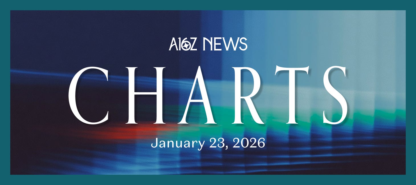
In the first half of 2025, AI Capex and consumer spending contributed roughly the same amount to net-new GDP.
To keep things in perspective, though, consumer spending accounts for ~70% of total GDP, so it’s still a much bigger part of the picture than Capex (and it’s not really close).
When it comes to growth, however, AI is the pro-cycle now, comprising an historically large share of total private investment.
The chart speaks for itself. There is some debate about how to precisely account for the AI Capex contribution to GDP, but pretty much everyone seems to agree that it’s a very big deal, driving growth in the technology sector, but also in utilities and industrials. Other than healthcare, which is generally considered acyclical, AI Capex appears to be the main event.1
It’s the power of . . . love?
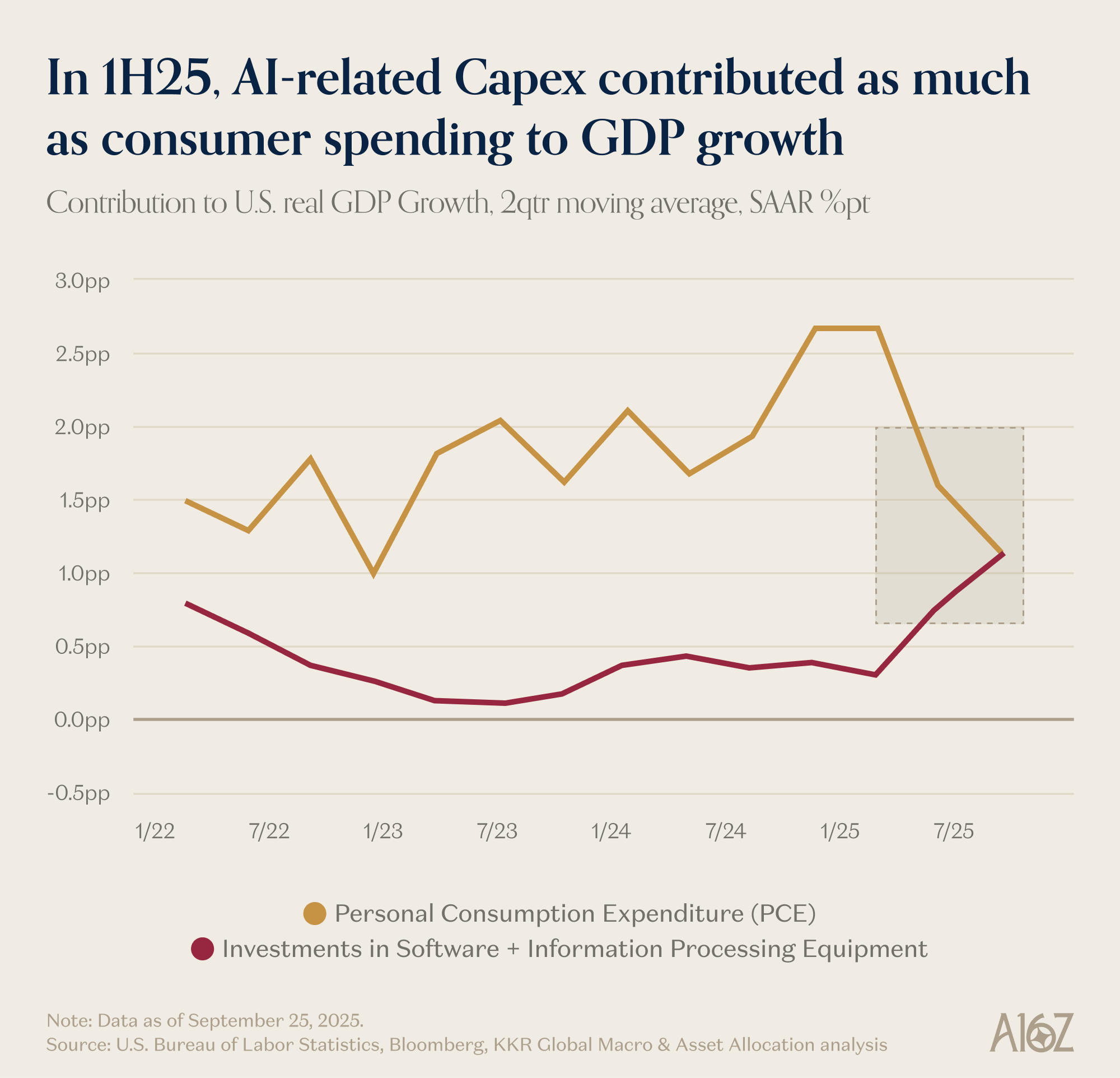
According to Consumer Edge transaction data published by The New Consumer and Coefficient Capital, US consumers spend more on OnlyFans than OpenAI and the New York Times, combined.
Since May, however, spending on OnlyFans has declined ever so slightly (which probably has nothing to do with the GPTs loosening the reins on NSFW prompting, no sir…).
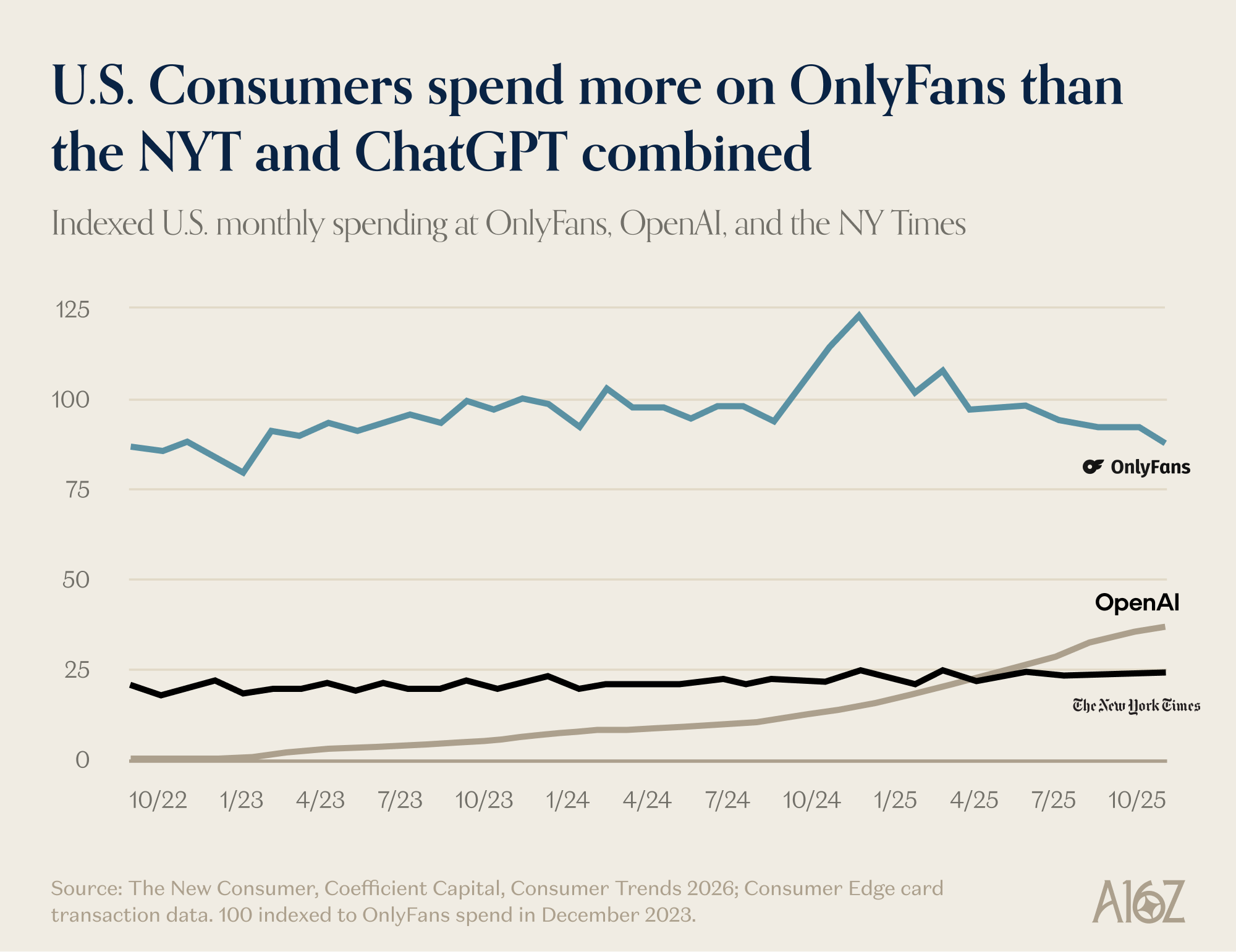
Incidentally, among AI subreddits, grok stands atop the leaderboard for NSFW mention frequency, if that’s any indication of where the action lies.
Well, we can’t really say that consumers are buying OnlyFans for the articles. But, as Jonathan Coopersmith most famously laid out, there is a long tradition of vice driving the leading edge of tech, especially video, including editing, distribution, and compression. From VHS to cable to online video, porn has been an early monetizer, paving the way for broader adoption.2
App Store, Engage!
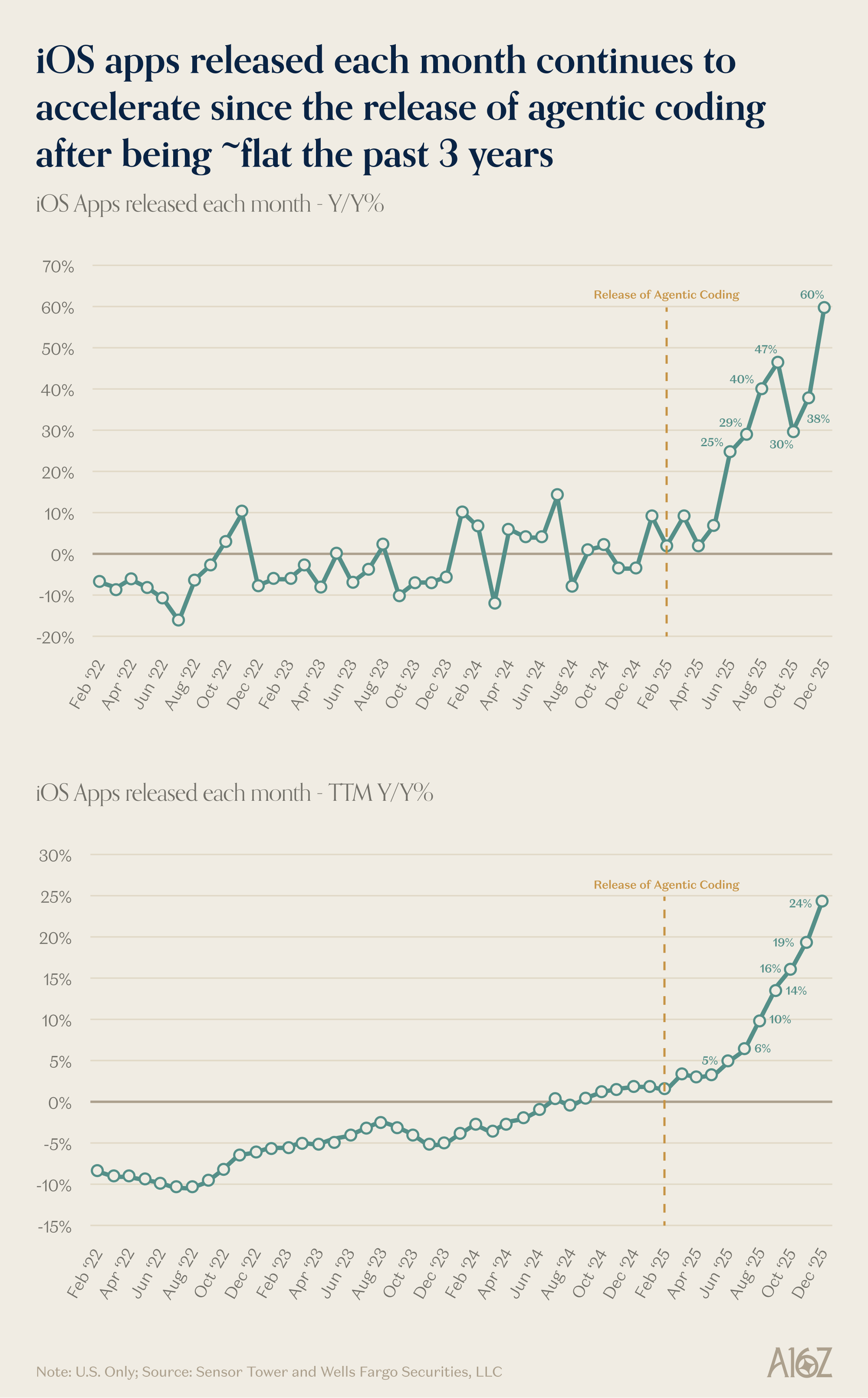
“Agentic coding” (aka “vibe coding”) has unleashed a torrent of new iOS apps in the app store.
After basically zero growth for the past three years, new app releases surged 60% yoy in December (and 24% on a trailing twelve month basis).
It’s starting to feel like 2008, when Apple first released the iPhone SDK (now called the iOS SDK). While it initially debuted with approximately 500 third-party apps, app downloads surpassed 1M in the first weekend (and reached ~1B by early 2009). More apps drew more eyeballs which drew more apps, all of which eventually unlocked hundreds of billions of dollars in revenue for app developers (and a multi-trillion dollar ecosystem that no one had ever heard of a decade prior).
AI is similarly opening up an entirely new surface area for value creation, and mobile is emerging as an early winner on the frontier.
The future is here, it’s just not evenly distributed
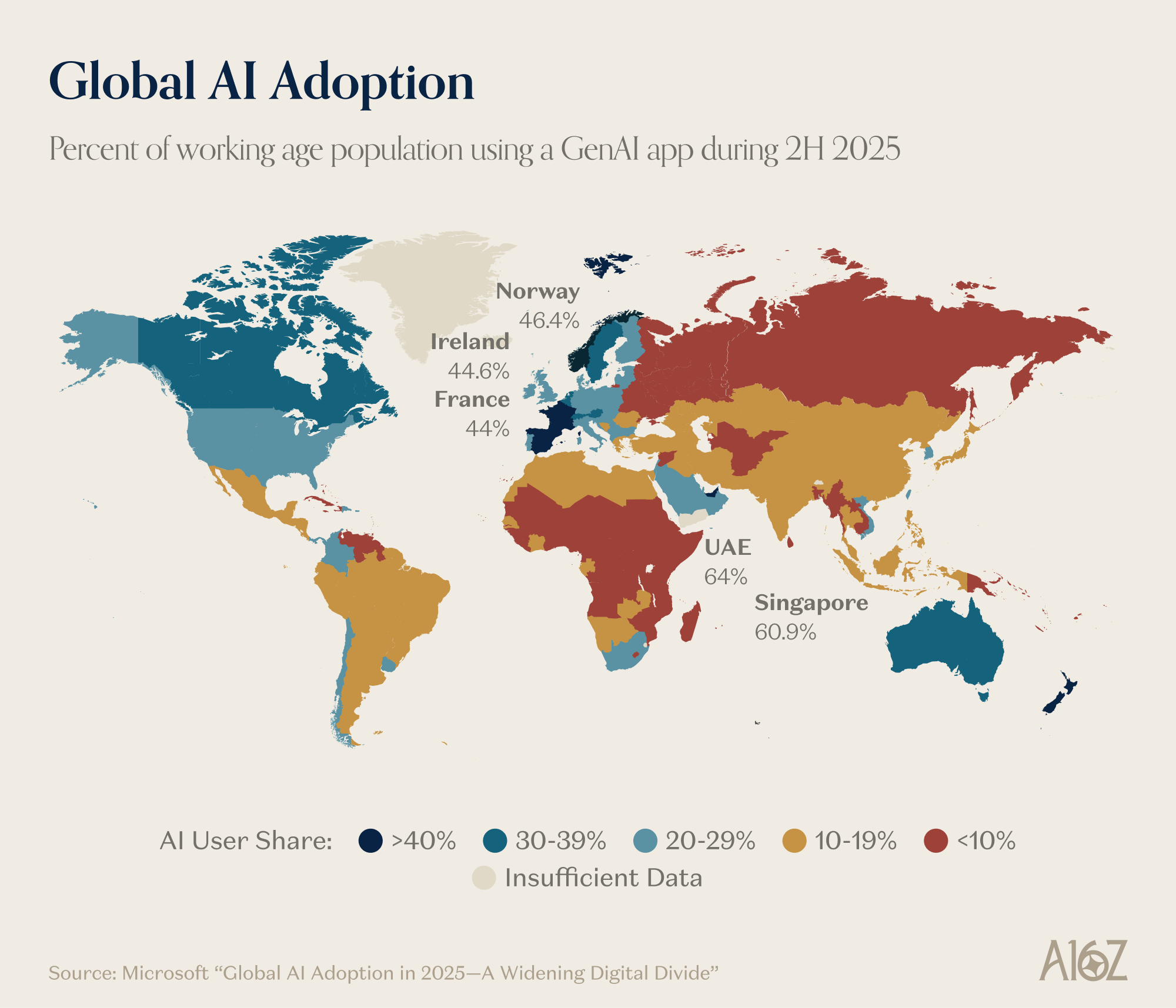
Microsoft released an “AI Diffusion” map, demonstrating the share of the working age population using a generative AI application during the second half of 2025. While adoption is increasingly widespread, there is a clear regional divergence such that “adoption in the Global North grew nearly twice as fast as in the Global South.”
Somewhat surprisingly, the UAE sits atop the leaderboard (followed closely by Singapore), with ~64% of the working age population adopting AI (at least once, during the measured period).
The US, for its part, increased adoption by ~2 percentage points since the first half of the year, but actually slipped a spot in the rankings from 23rd to 24th (following a big jump by South Korea).
Microsoft points out that AI adoption is hard to measure, so this is really just one way of looking at the picture, but it’s striking nonetheless.
Adoption is increasing pretty much everywhere, with roughly the entirety of the OECD demonstrating at least 20% adoption. If the adoption gap continues to widen, though, one can only imagine that the second- and third-order effects of being an “AI have v. AI have-not” will be amplified.3
Laying off the sauce
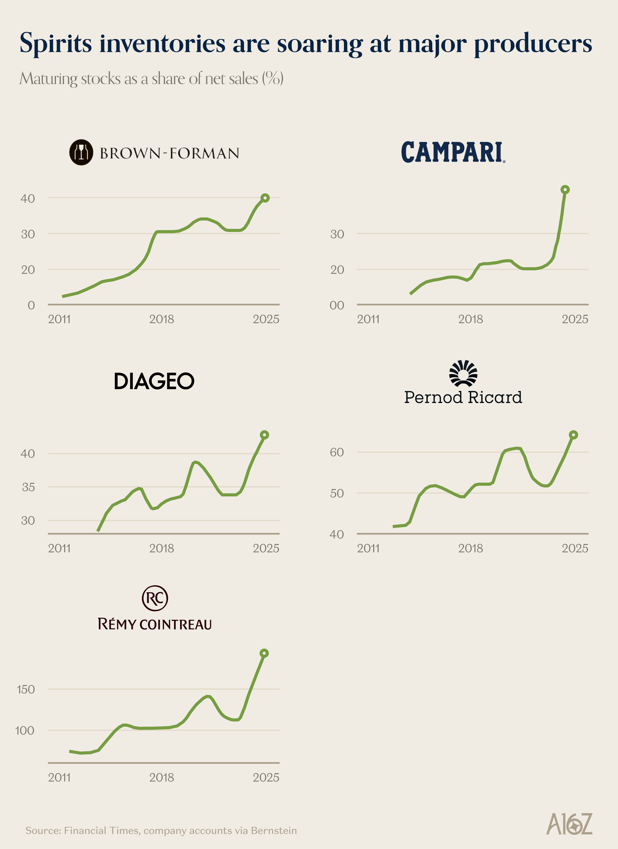
Five of the biggest listed alcohol producers are sitting on a combined ~$22B of inventory, the highest level in more than a decade (and an increasingly large share of total sales).
Remy Cointreau really breaks the scale with ~€1.8B in aging sprits that’s nearly double its annual revenues, and more than 80% of the company’s total market cap
No one knows precisely why alcohol sales have disappointed quite so much (and there probably isn’t one reason). Likewise, some part of the inventory build is the result of over-producing in response to a pandemic bump in sales (that turned out to be temporary).
That all being said, whether it’s GLP-1s, shifting consumer preferences (especially among younger folks), Chinese tariffs, and/or something else entirely, drinking as a global pastime has surely fallen off the wagon (at least for now).4
This newsletter is provided for informational purposes only, and should not be relied upon as legal, business, investment, or tax advice. Furthermore, this content is not investment advice, nor is it intended for use by any investors or prospective investors in any a16z funds. This newsletter may link to other websites or contain other information obtained from third-party sources - a16z has not independently verified nor makes any representations about the current or enduring accuracy of such information. If this content includes third-party advertisements, a16z has not reviewed such advertisements and does not endorse any advertising content or related companies contained therein. Any investments or portfolio companies mentioned, referred to, or described are not representative of all investments in vehicles managed by a16z; visit https://a16z.com/investment-list/ for a full list of investments. Other important information can be found at a16z.com/disclosures. You’re receiving this newsletter since you opted in earlier; if you would like to opt out of future newsletters you may unsubscribe immediately.
https://www.kkr.com/content/dam/kkr/insights/pdf/2026-outlook-high-grading.pdf
https://newconsumer.com/trends/consumer-trends-2026/ and
https://residualthoughts.substack.com/p/what-are-people-actually-using-llms
https://www.microsoft.com/en-us/corporate-responsibility/topics/ai-economy-institute/reports/global-ai-adoption-2025/
https://www.ft.com/content/9e6f024c-63b5-493f-bb35-6c1c05e90e55
The OnlyFans chart as published is incorrect — please correct it.
When you scraped the data from my original chart, you erroneously added the word "time" to the headline.
This is a chart showing US consumer credit and debit card spending via the Consumer Edge panel. It is not a measurement of time.
Original source is The New Consumer and Coefficient Capital: https://newconsumer.com/trends/consumer-trends-2026/ and https://www.coefficientcap.com/consumer-trends/consumer-trends-2026/
I'm curious how you obtained the graphs you present here, and the data behind them. For example, you show 2 graphs together, one labelled "iOS Apps released each month - Y/Y%" and the other "iOS Apps released each month - TTM Y/Y%". The only difference in the label there is "TTM", which means "trailing 12 months". However, it is clear the graph labelled "TTM" does not show the trailing 12 months - the horizontal axis runs from Feb 2022 to Dec 2025. So this graph is labelled erroneously - which is the first problem I will point out.
In fact the horizontal axis on the "TTM" version is exactly the same as the non-"TTM" version. Therefore the 2 graphs are ostensibly exactly the same graph, except for the vertical axis scale running up to 30% on the second graph, while the first runs to 70%. These graphs should therefore be the same shape, and the marked points (25%, 29%, 40%, 47%, 30%, 38% and 60% on the first graph, 5%, 6%, 10%, 14%, 16%, 19%, 24% on the second) should be the same on both graphs. Yet the graphs have a completely different shape, and those marked points do not agree.
Nor do the graphs seem to agree with other providers of iOS app release statistics. "42matters" for example shows app releases as being essentially flat for the last 3 months of 2025 (https://42matters.com/ios-apple-app-store-statistics-and-trends) at around 58k/month.
Can I confirm the URL of the source? I couldn't find anything by searching for "iOS Apps released each month - Sensor Tower and Wells Fargo Securities LLC". (It does seem a bit strange that Wells Fargo Securities would be providing charts of this nature).
Can I ask if these graphs weren't themselves AI generated and are not in fact completely "hallucinated"? This conclusion does seem to fit the evidence a lot more than the purported explosion in "agentic apps". Indeed, perhaps this is the reason the app store is *not* being swamped with AI generated apps?